

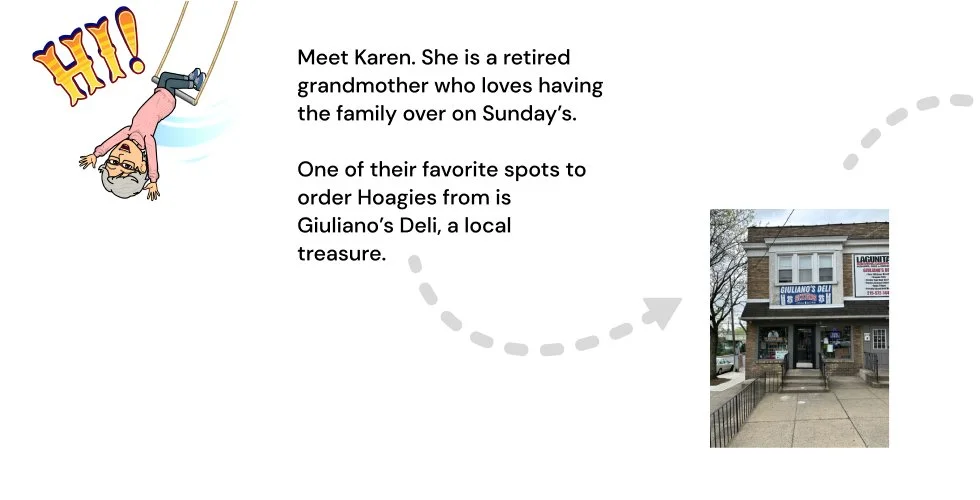
Family-owned and time-tested, Giuliano's Deli strives to provide the freshest products at fair and affordable prices. Because of their consistency and high quality, Giulinao's Deli is THE go-to spot for hoagies and other fresh goodies, be it for lunch, dinner, or the much-anticipated Bird’s games on Sundays.
We all know about long lunch lines and extended pick-up waits. While there are several pre-ordering options available, none are tailored to the community of Glenside.
Giuliano's Deli Mobile App fills that gap by allowing customers to place orders directly with Giuliano's POS system while earning points and rewards that can be used within Glenside's Chamber of Commerce network.
Giuiano’s Deli
Overview
Challenge
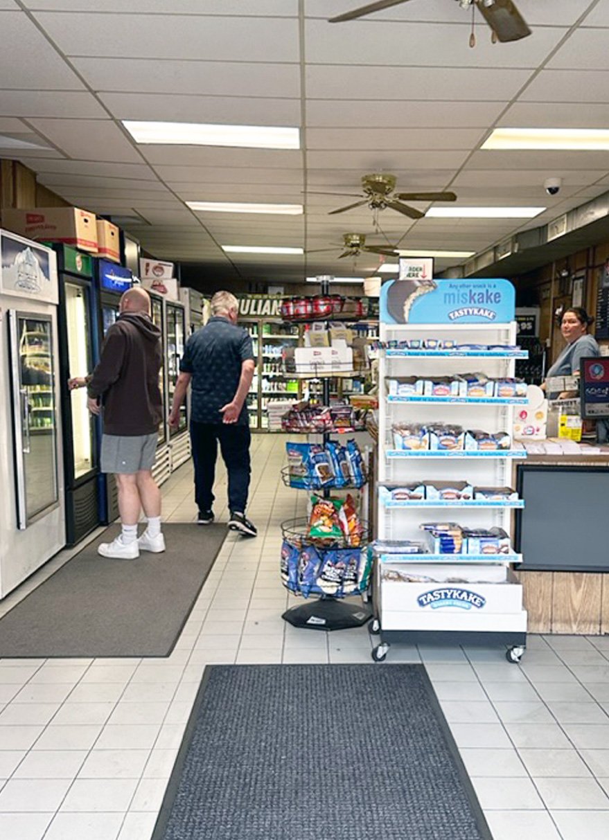
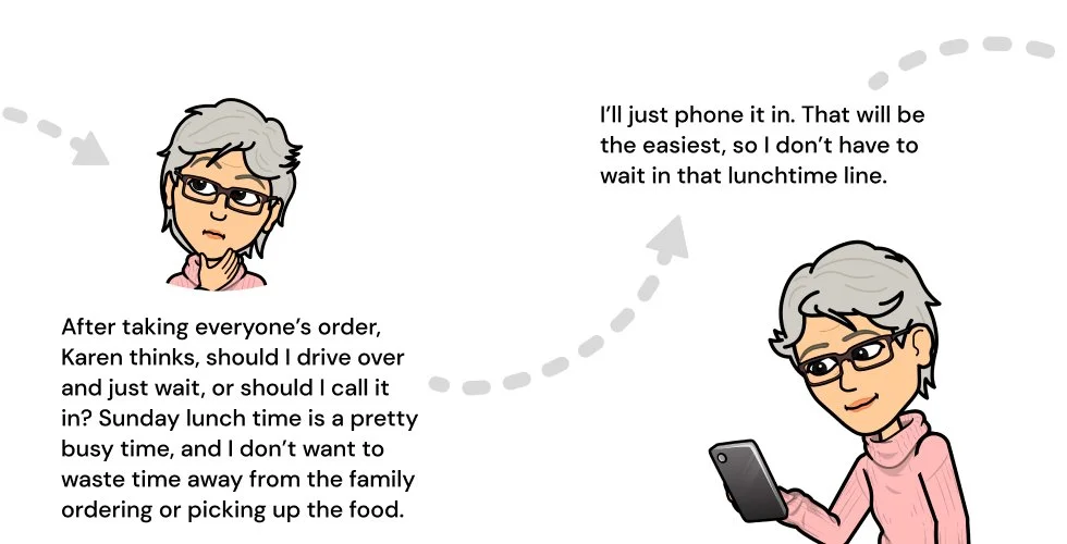
During peak hours, specifically Saturday & Sunday lunchtime, the wait times become very long. Customers were ordering on the phone and in person, taking time from staff being able to prep for the impending rush.
Goal
Design an app from the ground up that provides seamless ordering and applies loyalty program points to a network of small businesses in Glenside PA.
Deliverables
Prototype of Mobile App
Project Duration
3 Months
My Role
UX Designer - User Research, Information Architecture, Lo-to-High Fidelity Wireframing, Prototyping, Usability Testing
My Tools
• Paper & Pencil
• Figma
• Photoshop
• Miro
• Google Forms
• FigJam
• Quicktime
Approach
Interviews - Customers, Deli Workers and Owners
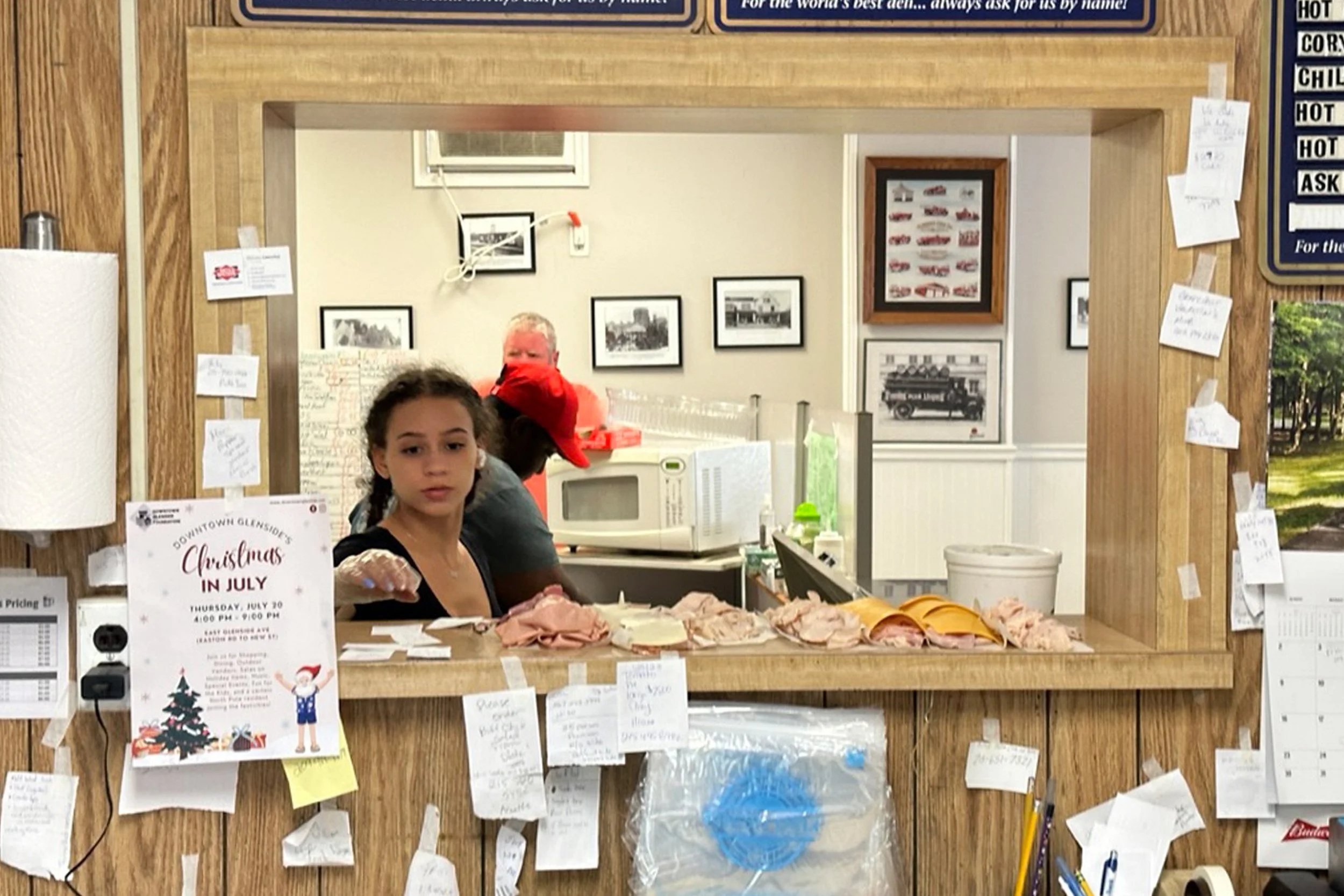
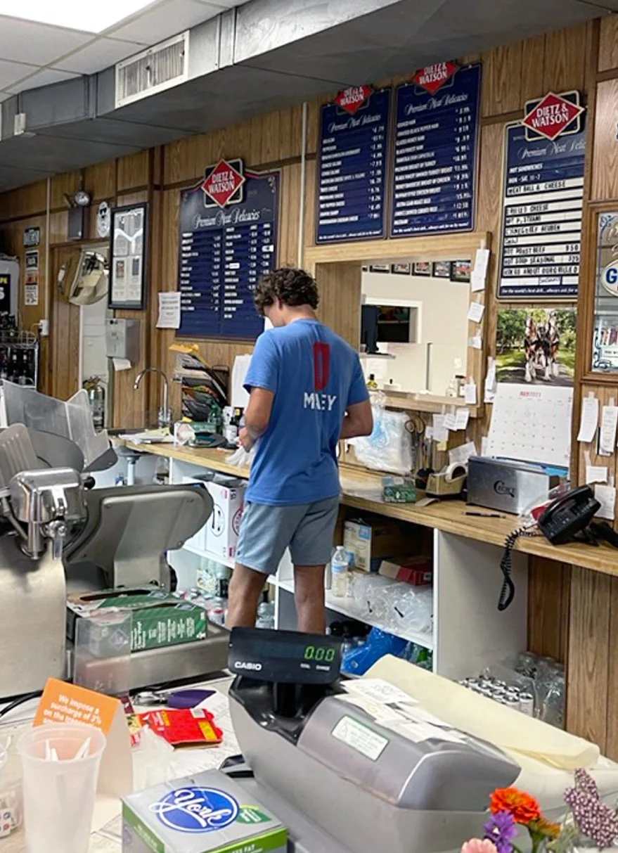
Observation of deli in action
Affinity Mapping
Unmoderated Usability Testing
Design Process
Building an app from the ground up meant using a user-centered design process to determine pain points and potential solutions.

Interviews
Observation
Discover

Journey mapping
Personas
Define

User Flows
Site Mapping
Lo-Fidelity Wireframes
Usability Testing
Iterations
Design

High-Fidelity Wireframes
Design Language
Deliver
User Research
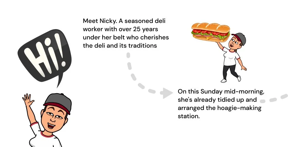
I conducted interviews with customers, community members and the owners of the business.
Interviews
During peak hours, specifically Saturday & Sunday lunchtime, the wait times become very long. Customers were ordering on the phone and in person, taking time from staff being able to prep for the impending rush.
After observing the deli in action during a Saturday and Sunday lunch rush, I identified a few pain points.
Observation
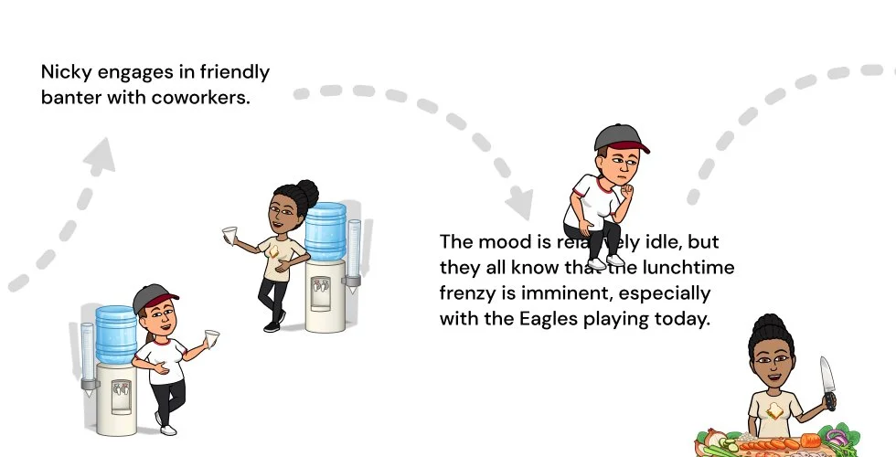
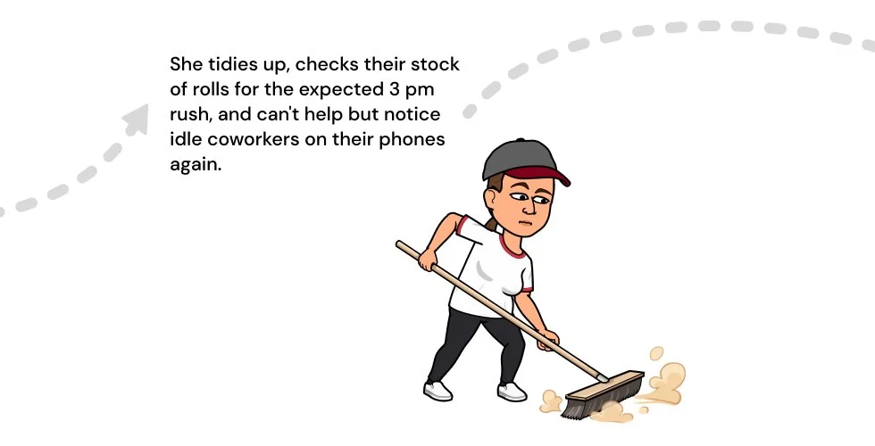
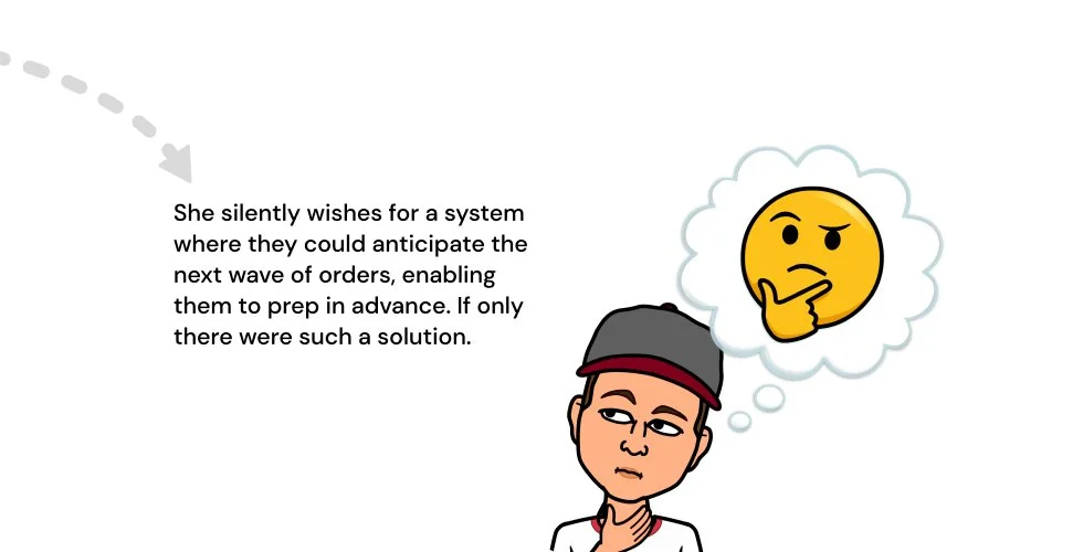
Long down time for employees. Boredom and no sense of how many orders they will have to make later.
Pain Point 1: Boredom
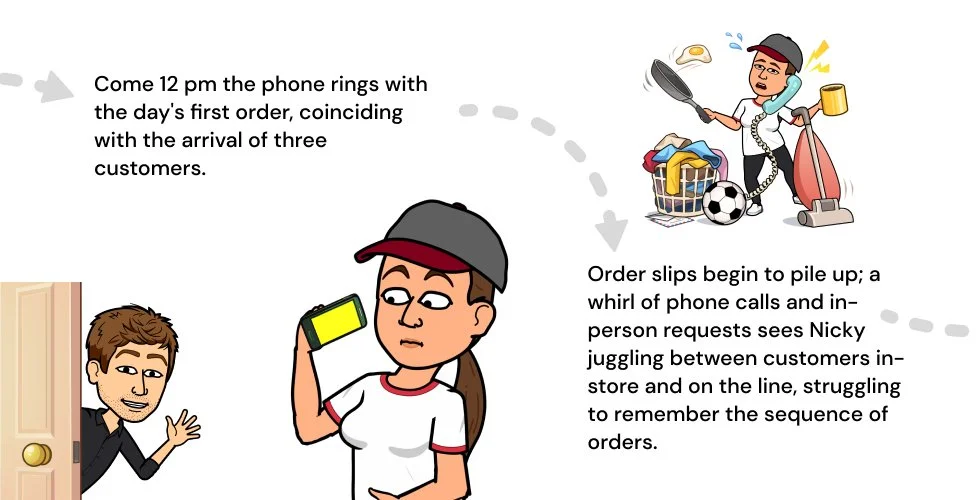
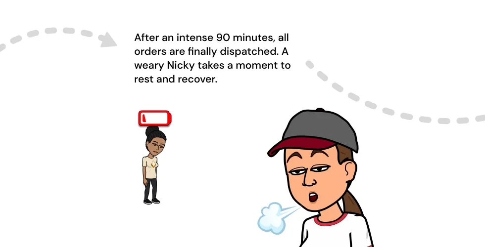
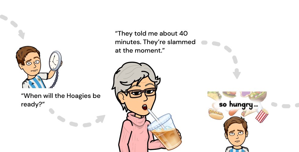
Starkly contrasting the boredom of long downtimes, high traffic times were stressful.
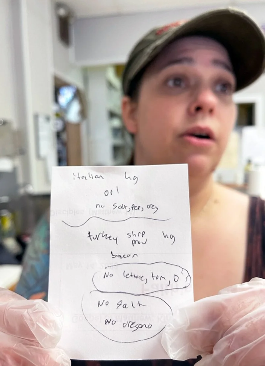
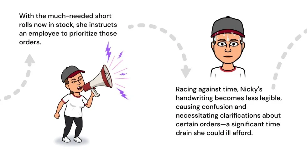
Orders were taken over the phone, and handwritten, taking away time from food preparation and adding to stress.
Pain Point 2: Stress
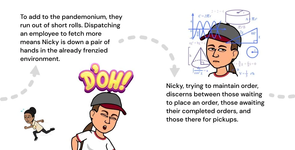
Due to the lack of preparedness of the employees, long wait times grew as a rush of orders arrived at once.
Pain Point 3: Long wait times
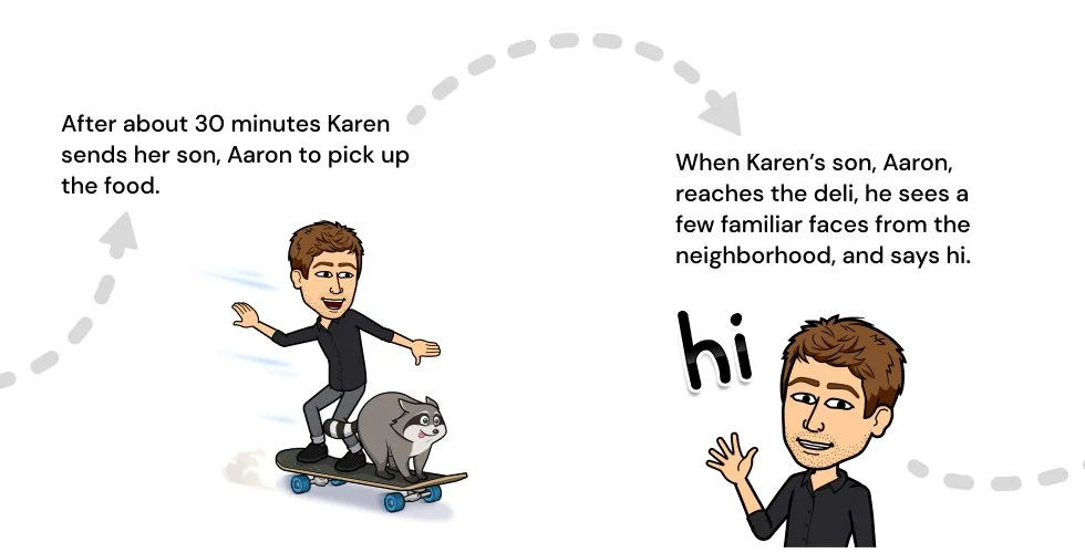
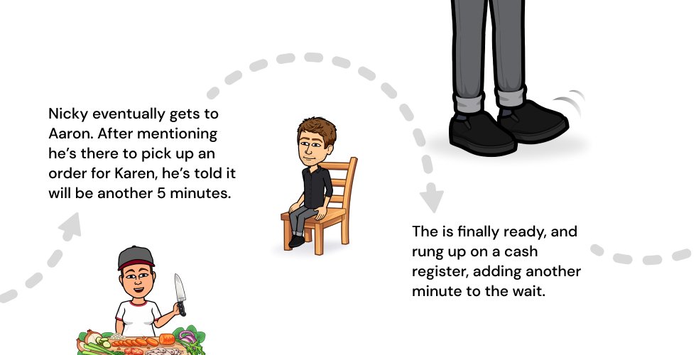
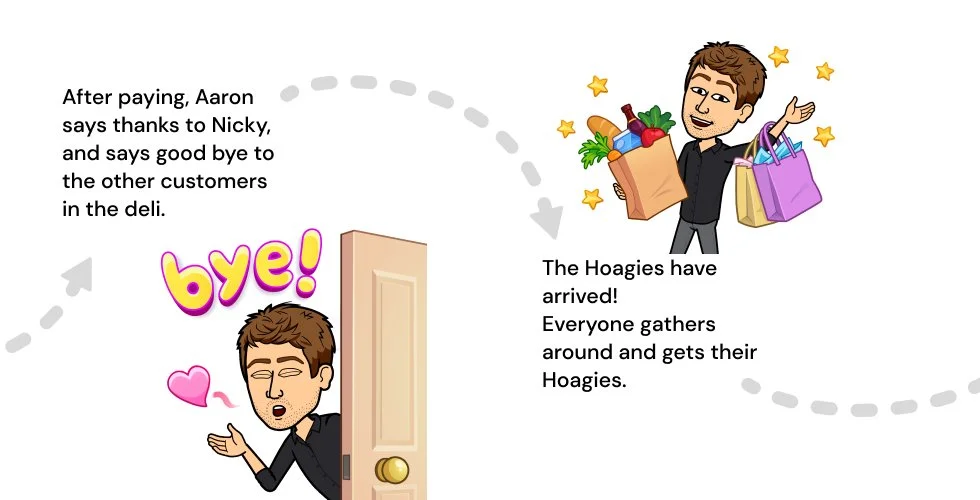
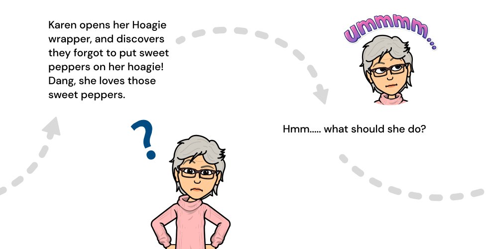
User Journey: Nikki
User Journey: Karen
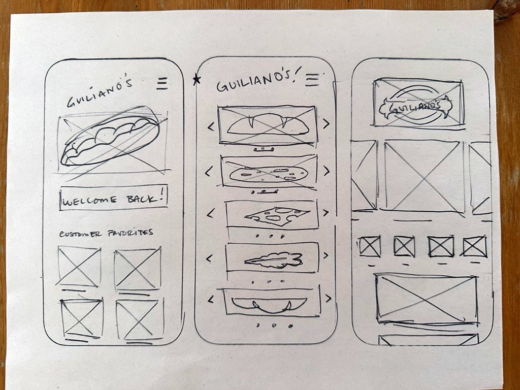
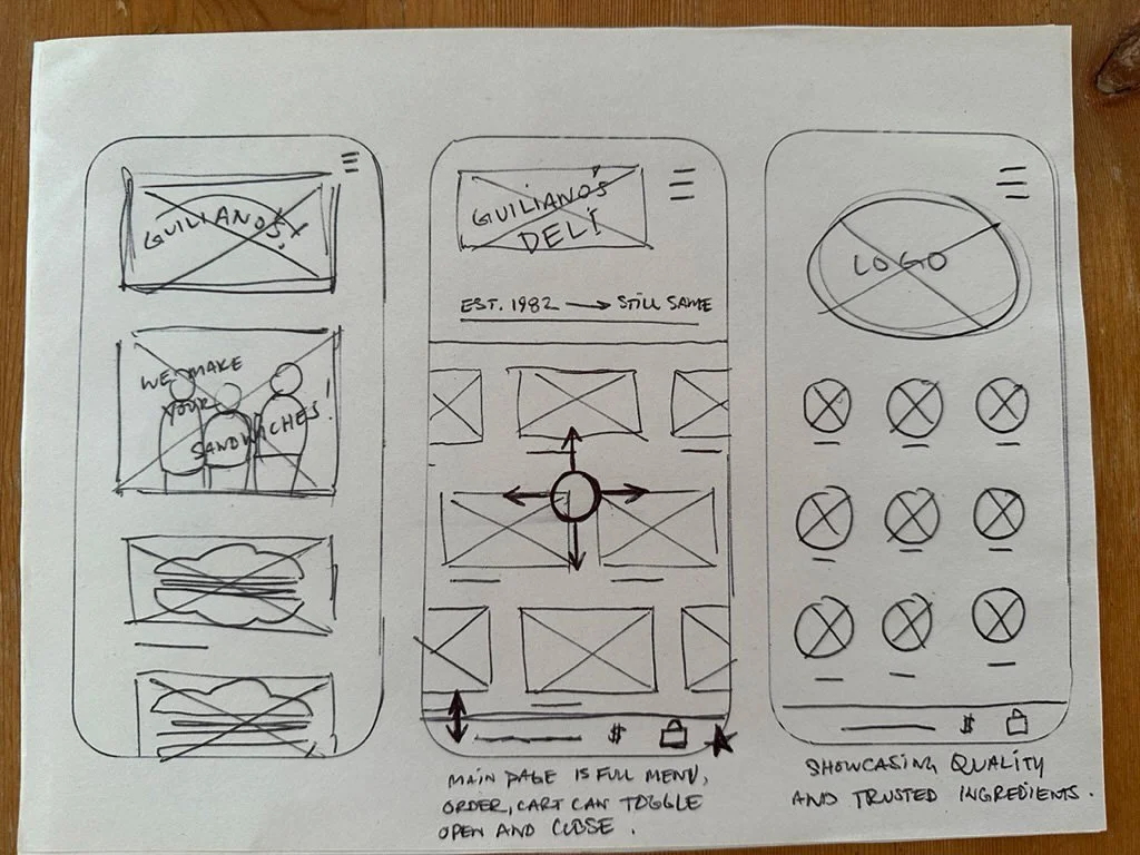
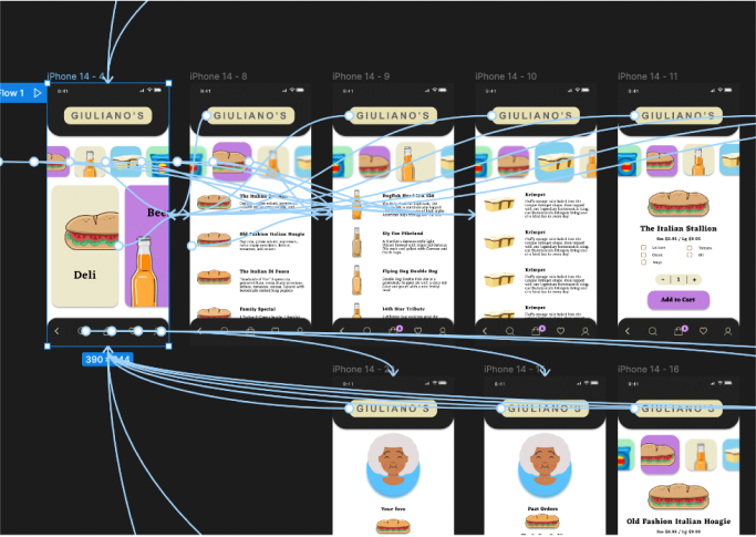
Paper Wireframes
I began the process by sketching wireframes on paper. This method was efficient, allowing me to swiftly iterate through numerous ideas using just a pencil and pen
Digital Wireframes
I enjoy crafting my own digital wireframe components; not only does it offer additional practice in Figma, but it also aids in more accurately translating my paper sketches to digital designs. During this stage, I make adjustments and further refine my ideas.
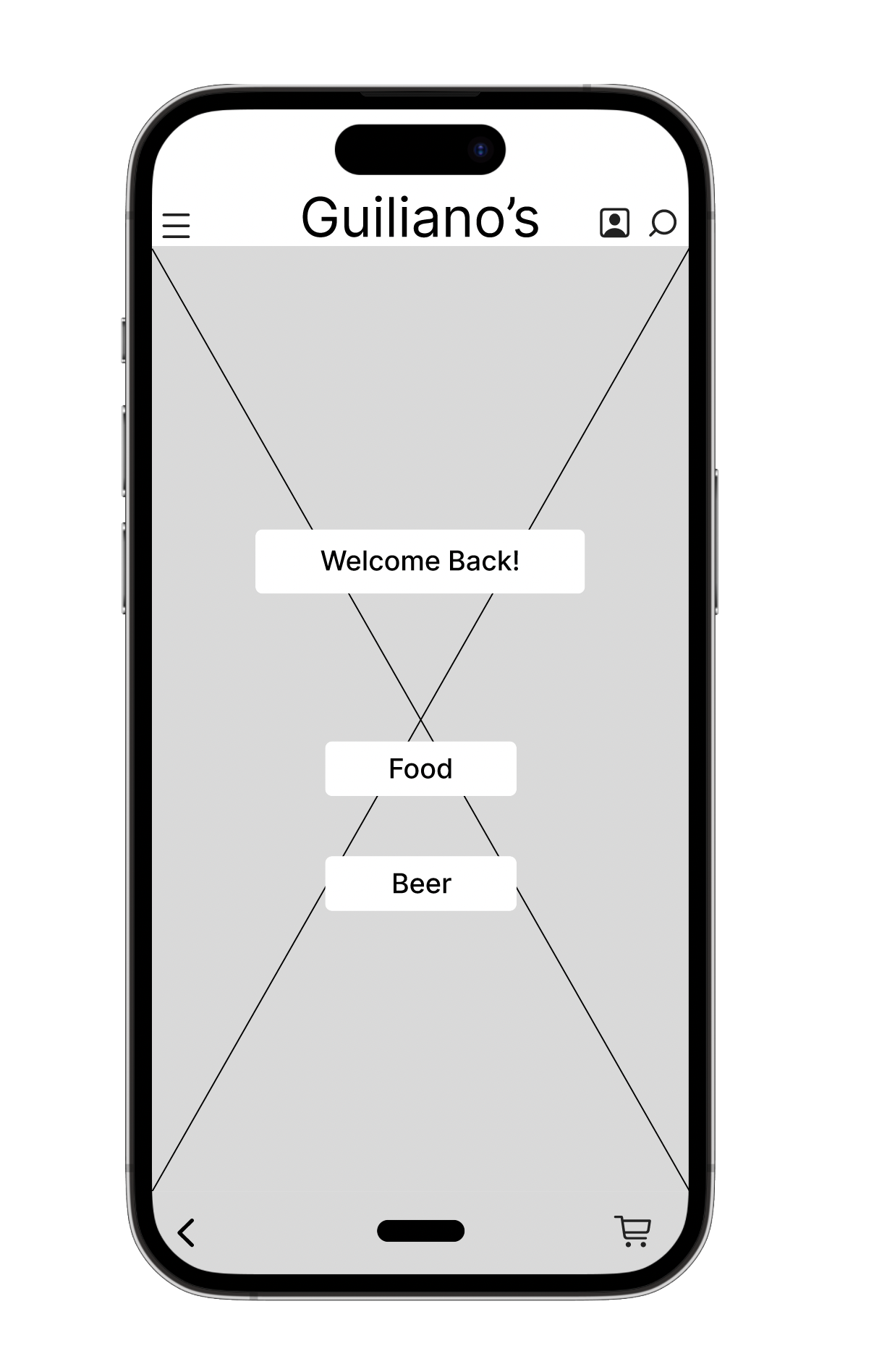
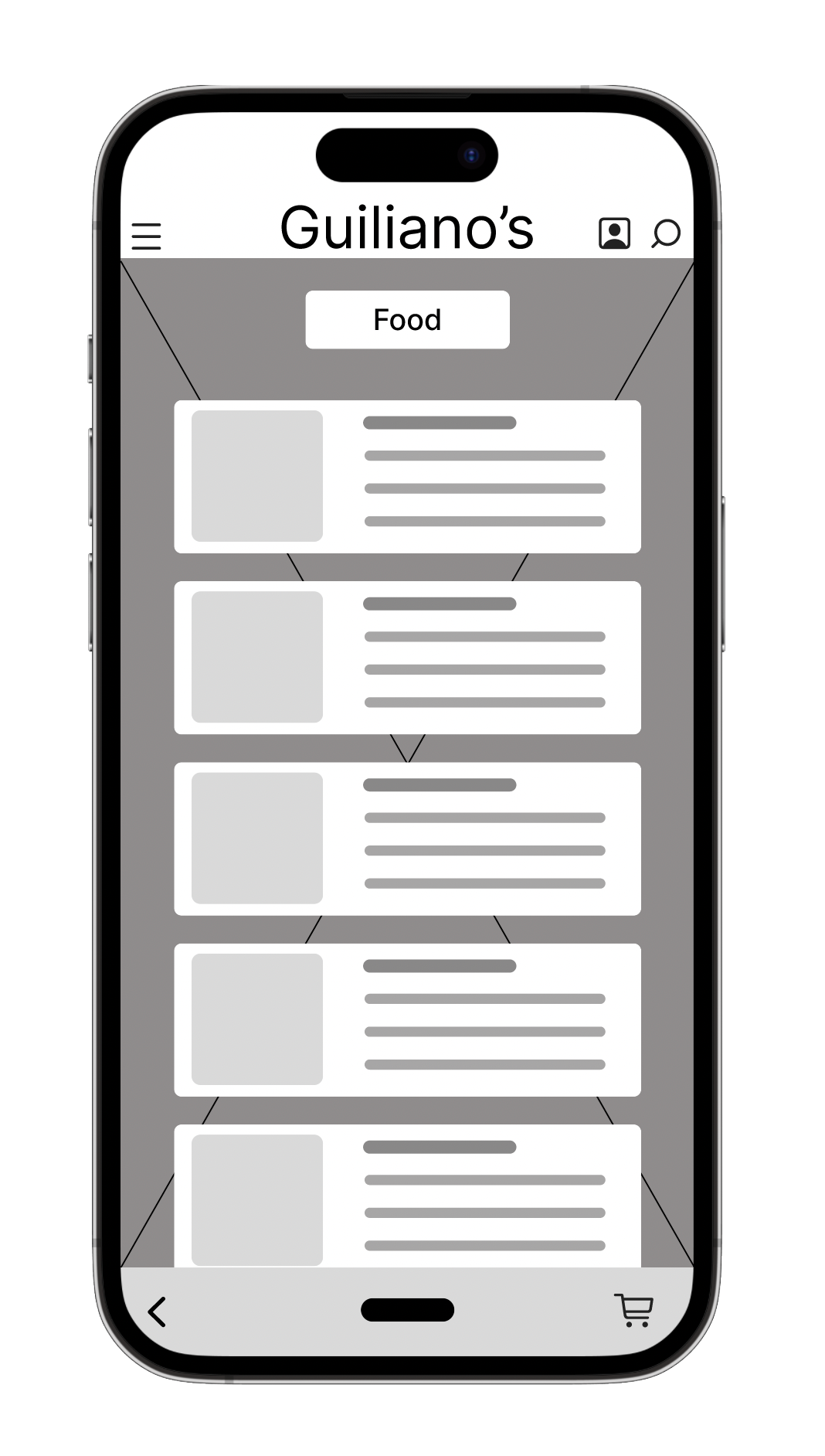
Lo-Fidelity Prototype
After finalizing my digital wireframes, I moved on to crafting a low-fidelity prototype. In this instance, I initially used a version of the UI design that I later modified. My goal was to ensure the navigation was both intuitive and engaging for users. I modeled my navigation approach on the NN/g navigation guidelines.
Usability Study: Findings
I had a few patrons of the deli test the prototype.
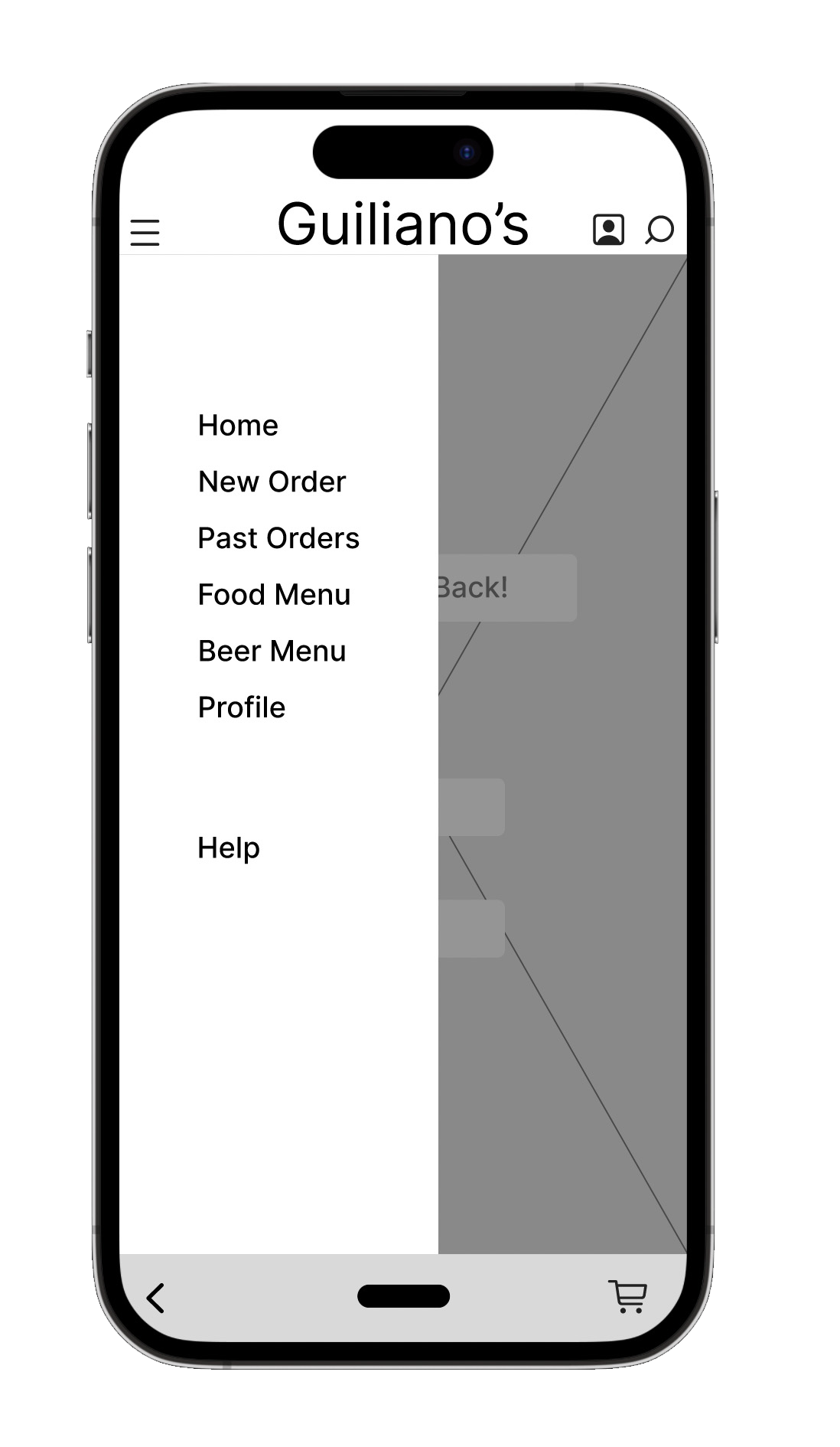
Some of the navigation was not that intuitive
Stakeholder (deli owner) wanted more of a feel and branding in line with the deli and current website.
Wanted to be able to quickly toggle between cart and menu
Refining the Design
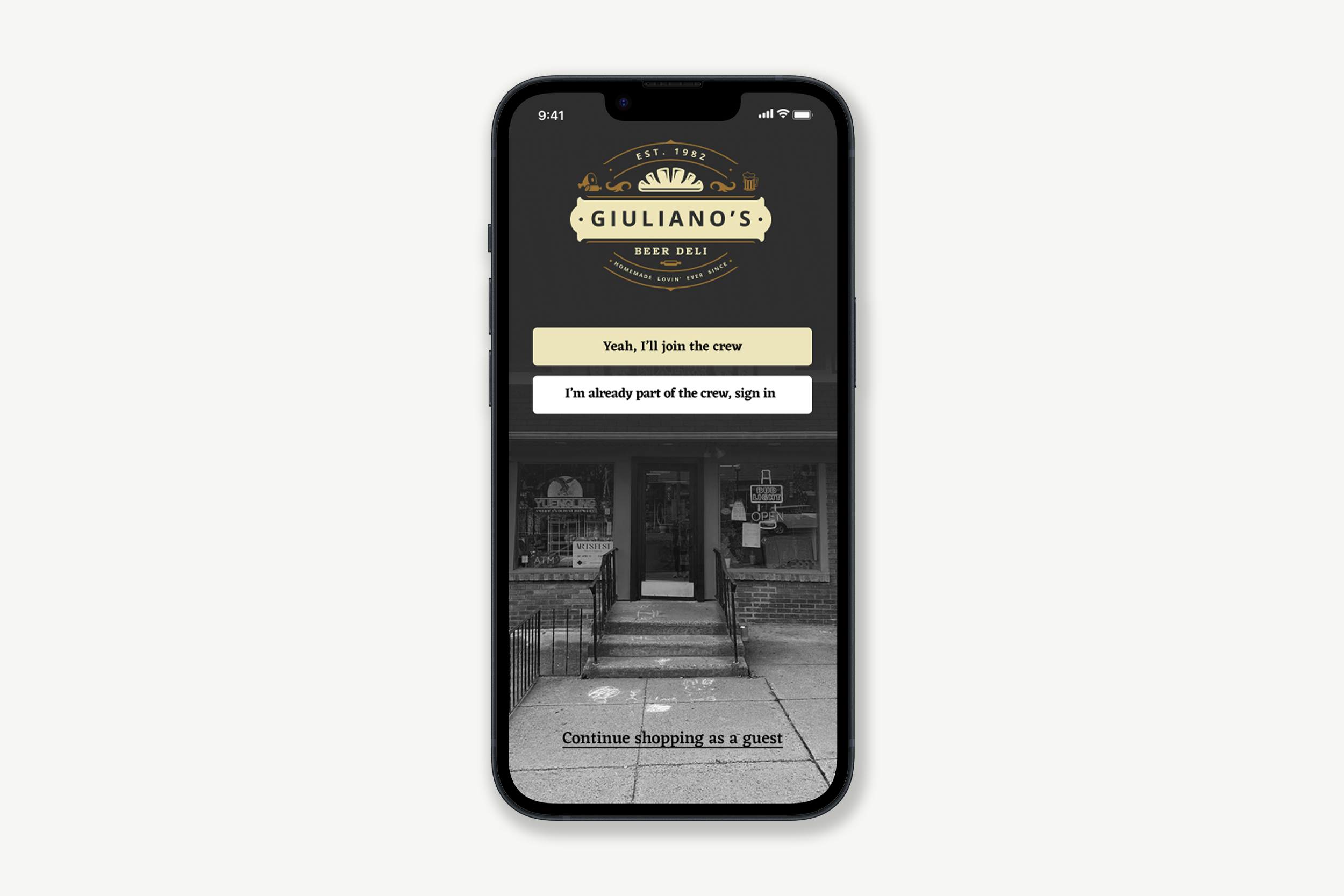
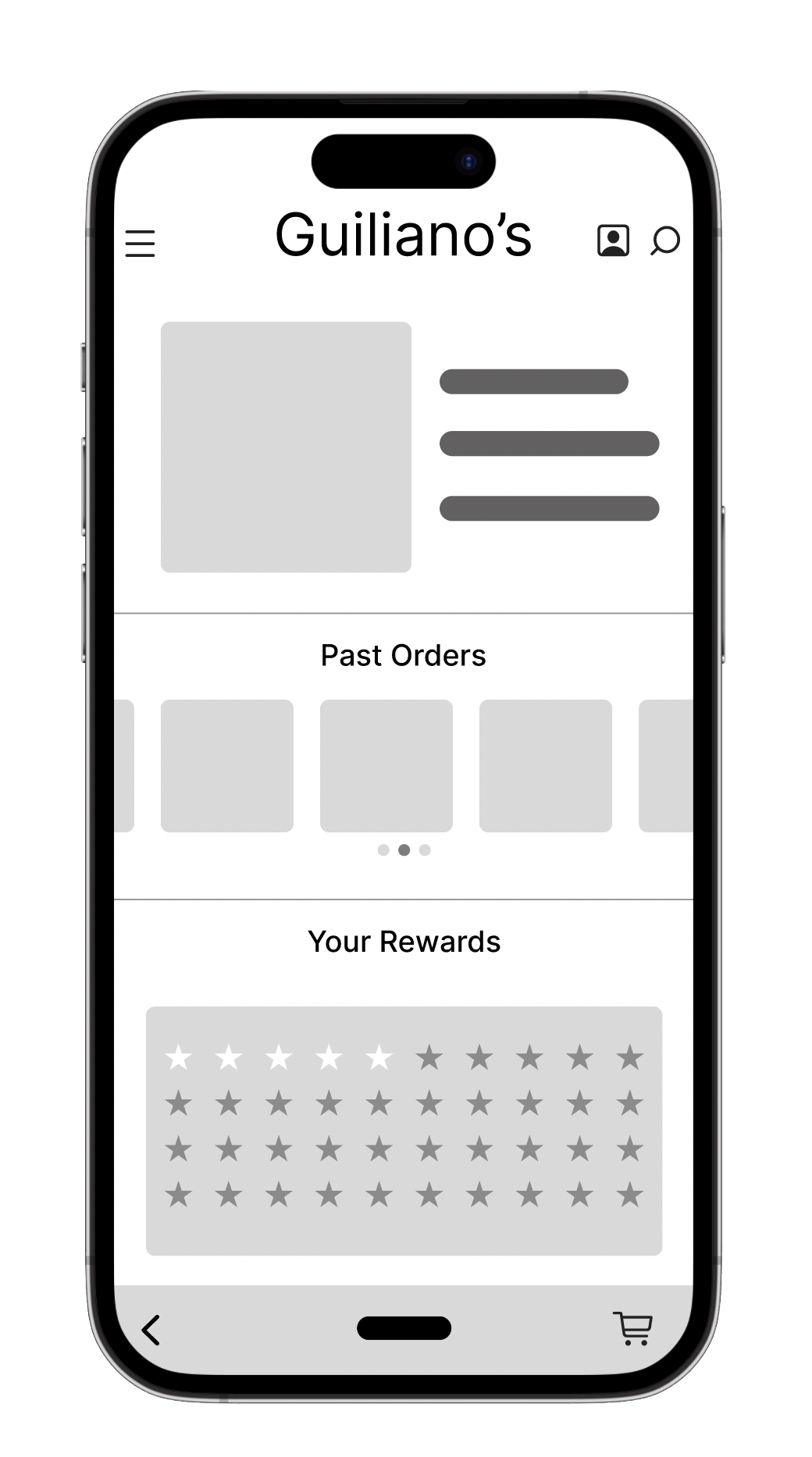
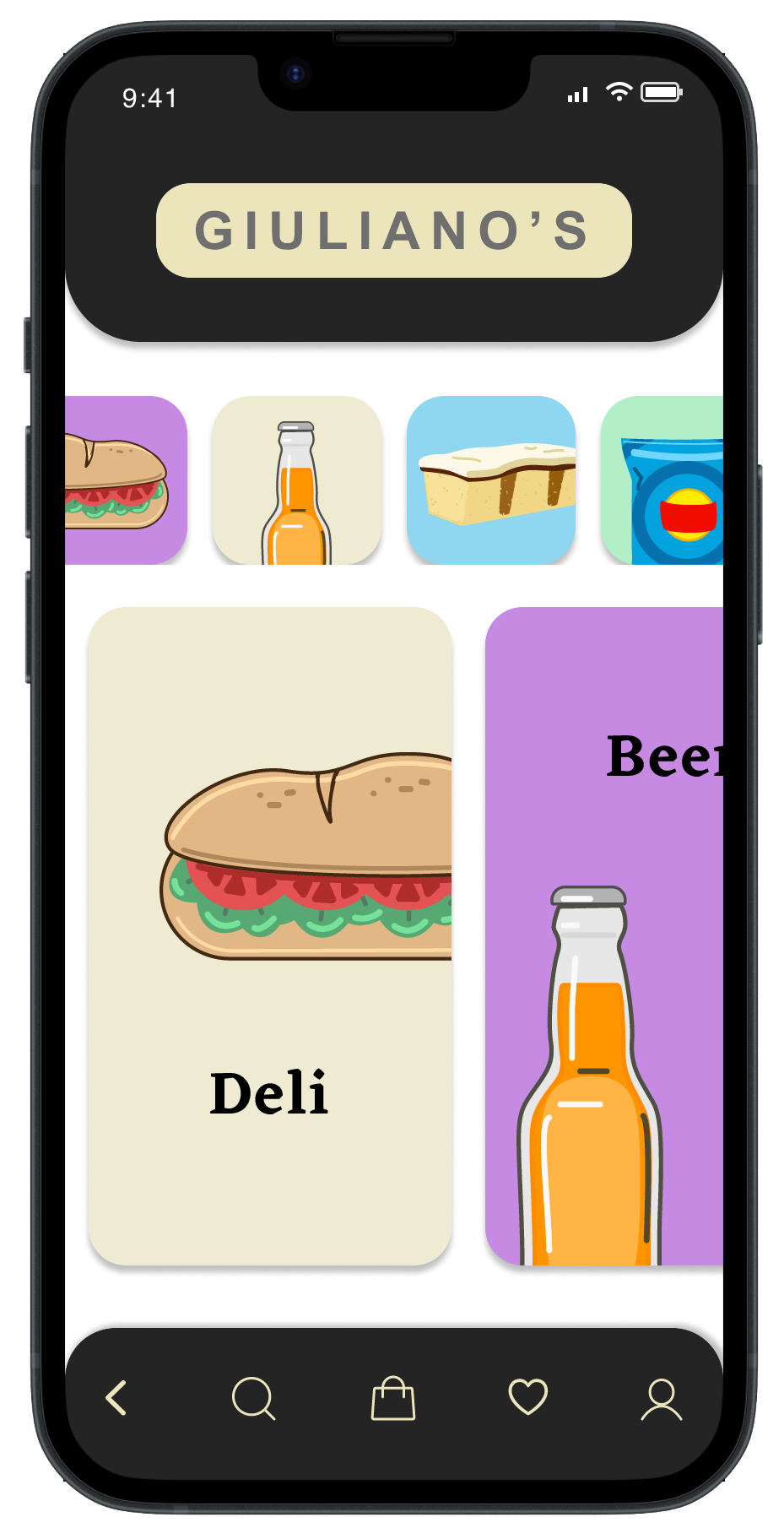
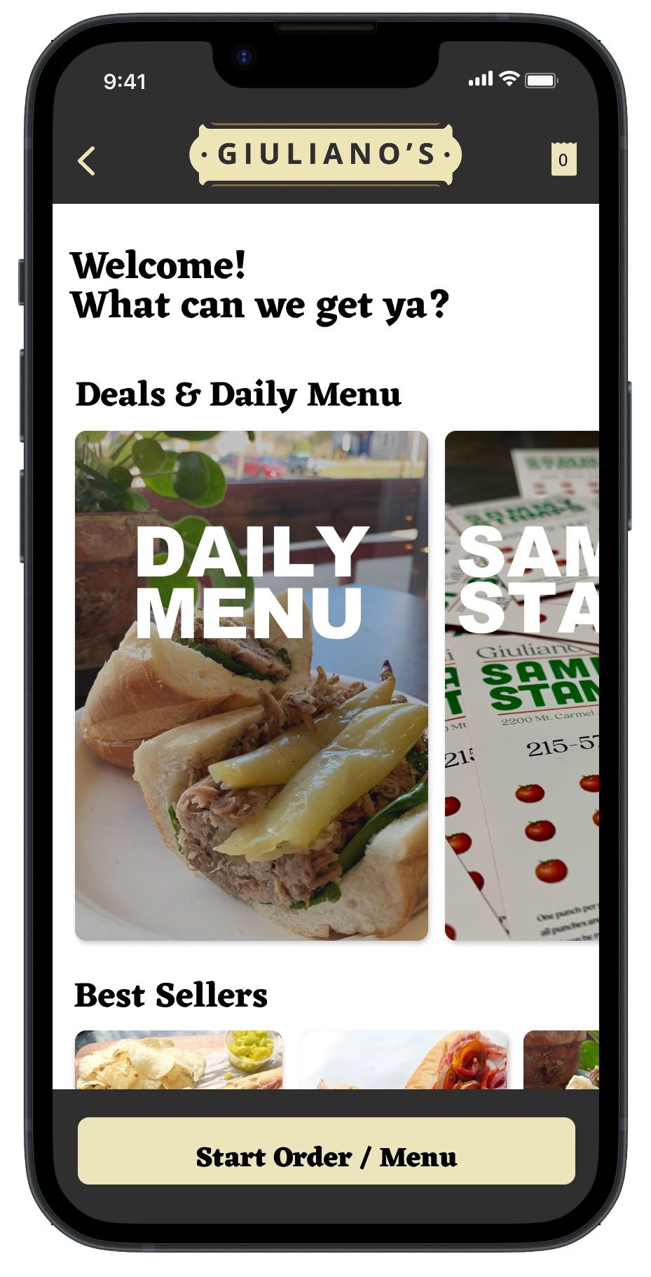
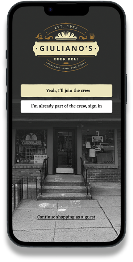
From my usability study data, I promptly pinpointed areas for improvement, such as enhancing the intuitiveness of the navigation. Both users and stakeholders expressed a desire for a stronger "deli" ambiance. To address this, I incorporated real photos from the deli's social media accounts. Additionally, I employed a more colloquial tone to truly capture the essence of the Glenside Deli.
Before usability study
After usability study
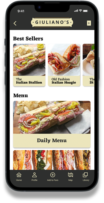
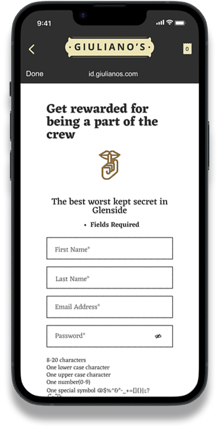
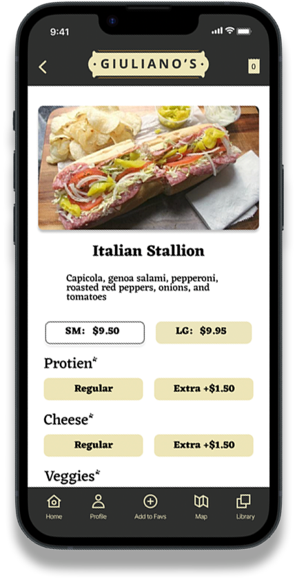
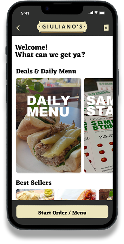
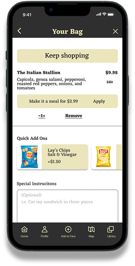
Mock Ups
Takeaways
My design aligned with the existing aesthetic of the deli and its website. I believe this continuity made users familiar with the website feel at ease with the mobile app's brand. While I initially created various icons and illustrations, I found that incorporating photos from the deli's social media enriched the design. This approach effectively preserved the fresh feel of the deli within the app. Furthermore, the language chosen mirrors the local colloquial tone, adding a touch of playfulness and authenticity to capture the deli's essence.
What I learned
I've come to realize that my work on this mobile app isn't over. Throughout this journey, I've grasped the intricacies of a UX project. Beyond refining my skills in UI design, I delved into the WCAG accessibility guidelines and learned how to weave them into my designs. Beyond mere aesthetics, I've recognized the pivotal role of UX research in creating an outstanding product. Feedback is invaluable! A prime focus for me is the interface and navigation for the app's pre-order section. It remains a work in progress. My aim is to maintain an uncomplicated UI and ensure navigation is as seamless and intuitive as possible, a goal that demands considerable design insight
Next steps
Create a comprehensive design system for the Mobile App that will tie into the entire ecosystem of the Chamber of Commerce network.
Improve and rework some of the navigation elements as well as redefine the user flow to reduce clunkiness and make a smoother ordering experience.
Finalize and incorporate the Pre-Order/Pick-Up feature of the app. This is one of the main features of the app to reduce stress, bottlenecks, and wait times.