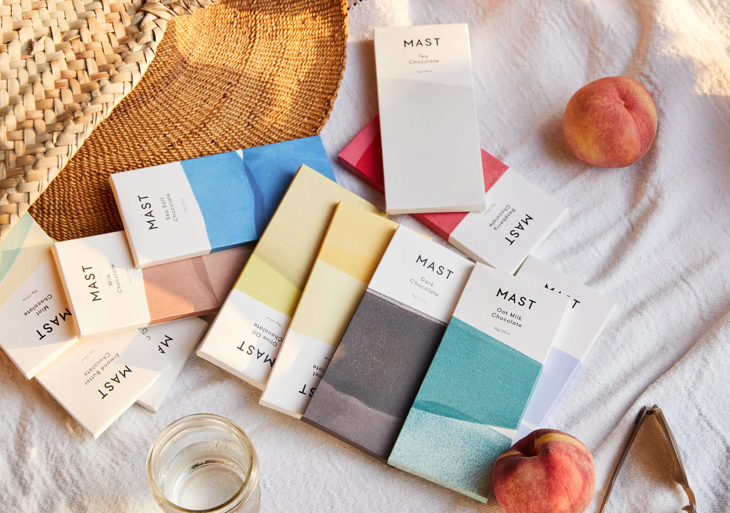
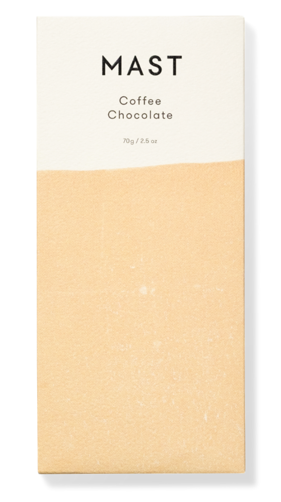
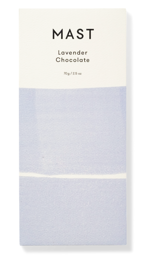
Mast Chocolate
I was commissioned to design and create the artwork for the Mast Chocolate packaging series.
Known for their artistic and creative packaging, this was a challenge I was happy to take on.
After the packaging design was complete, I was hired as the graphic designer to produce print-ready files for production.

Inspiration and Brief
Mood Board
The client's vision was outlined through a curated Pinterest mood board. The board prominently featured images of clothing and paper being dip-dyed, conveying a sense of playfulness and a fascination with ephemeral, transient beauty.
Color Theme
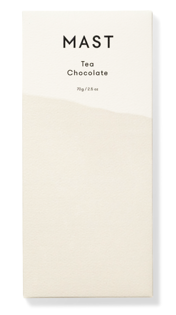
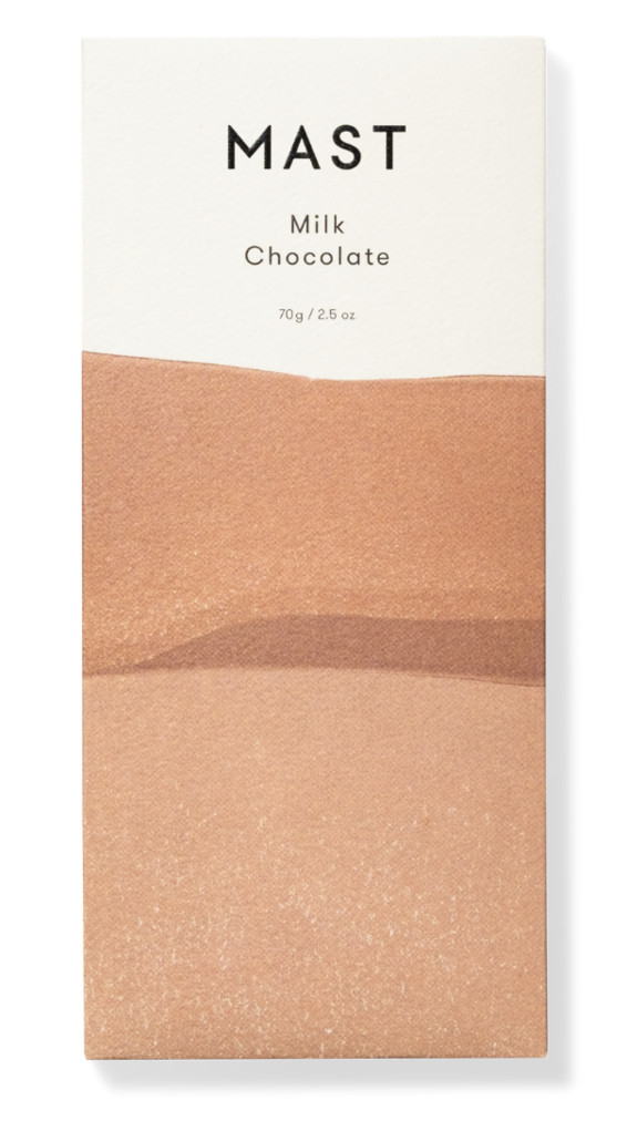
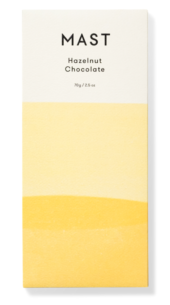
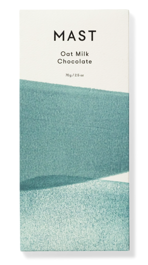
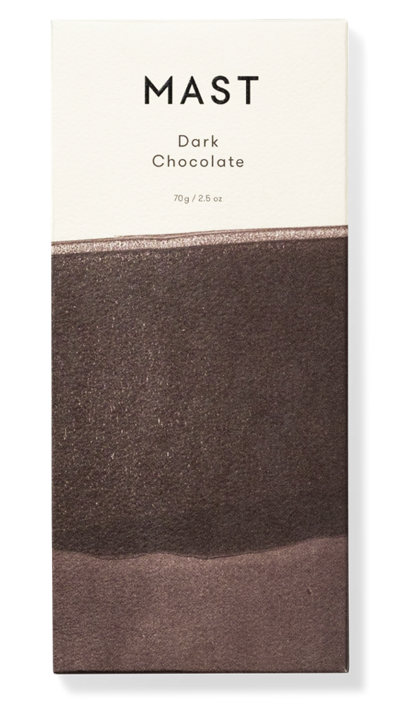
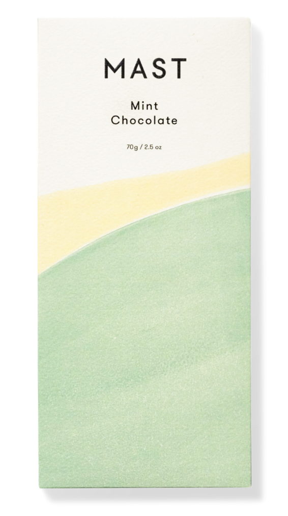
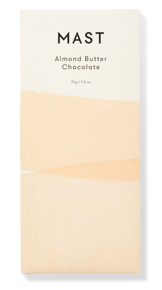
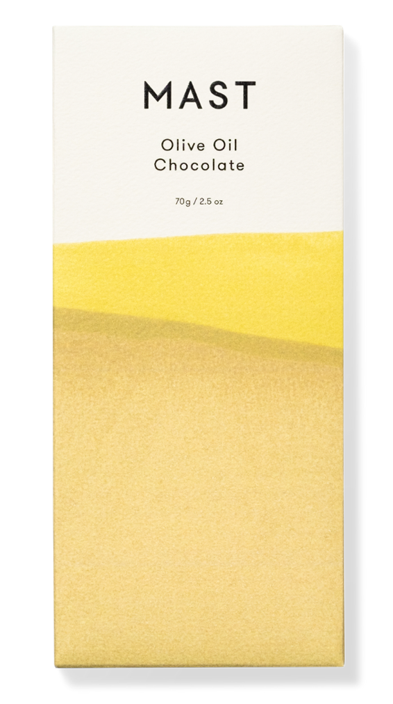
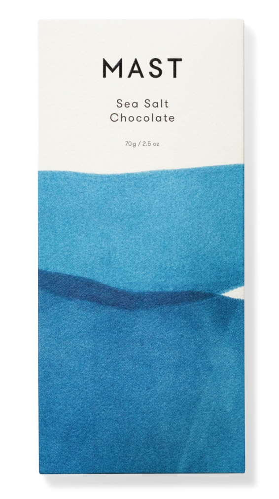
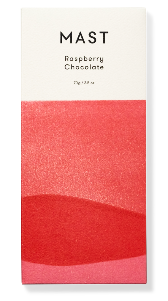
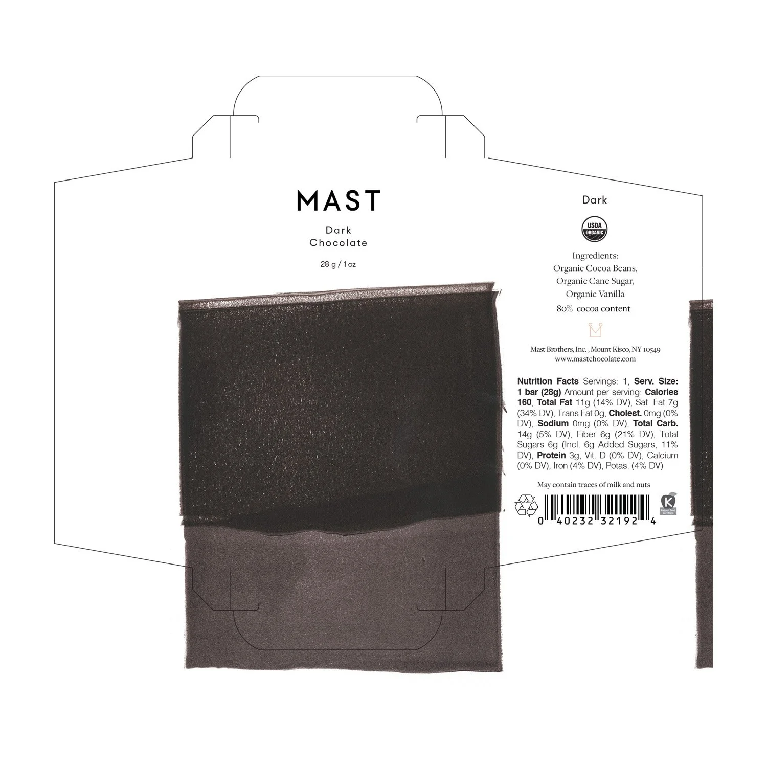
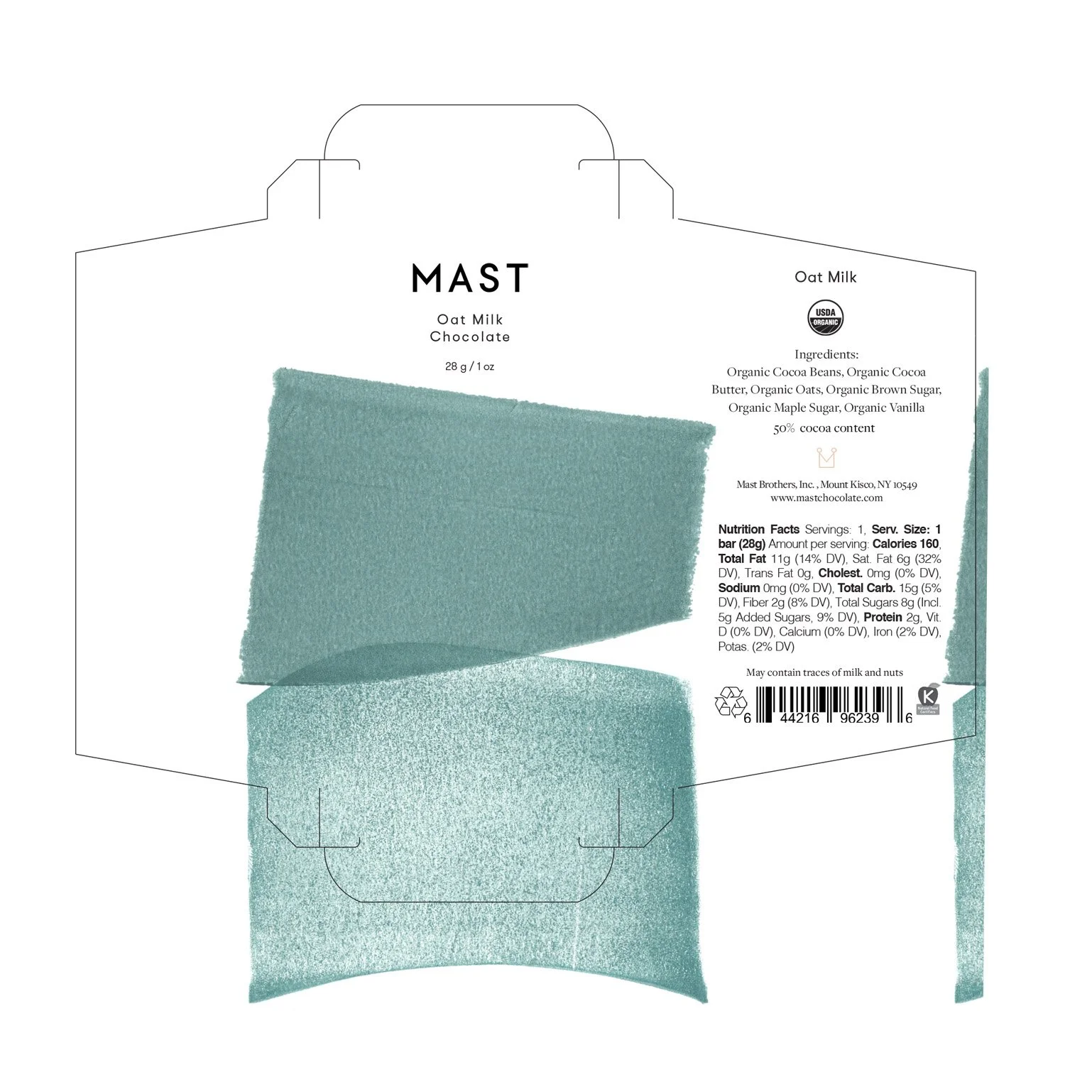
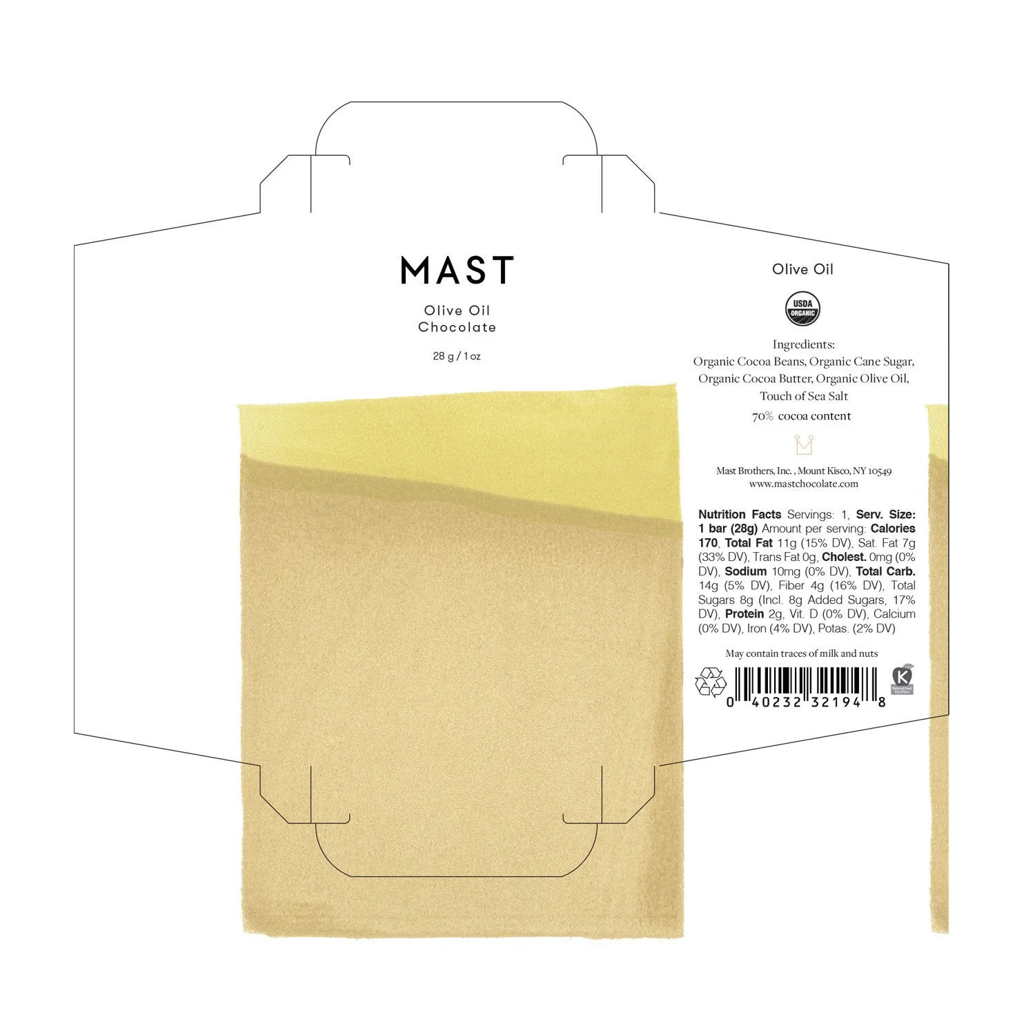
Each chocolate flavor was to be symbolized with a unique color, establishing a distinct identity and visual appeal.
Influences
The project drew diverse inspiration, from DIY dyers and earthy ceramics to high-end fashion brands like PO-EM. These references helped us to build a creative foundation for the design process.
Packaging Material
An important aspect of the brief was the desire for an artistic feel to the packaging. The client envisioned the wrapper to mimic the textures of watercolor paper or print paper, adding an artisanal touch to the final product.
Experimenting with Art
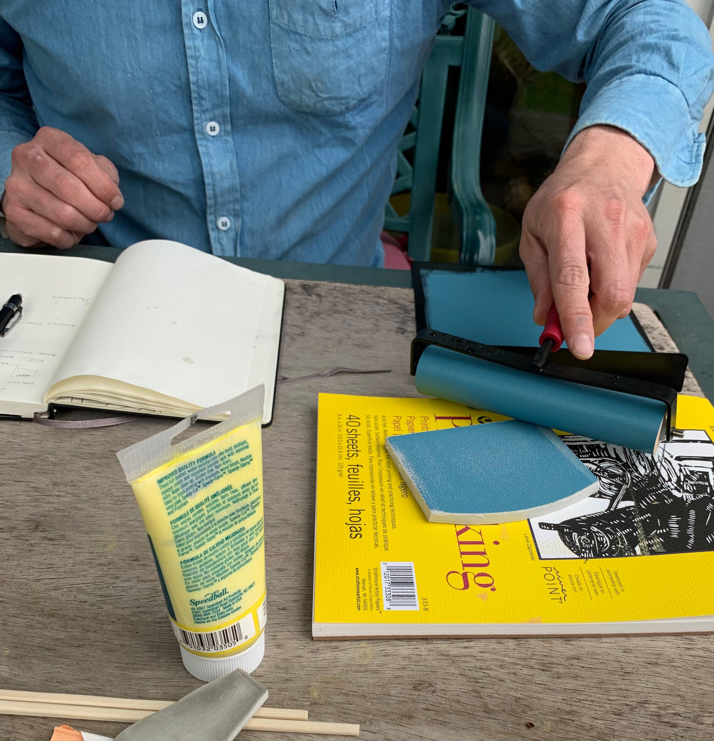
To develop the artwork for the package design, I explored various techniques. These included dip dyeing paper and fabric, mono printing, and lino cutting.
Linocut makes the cut
Following a series of experiments with various techniques, I settled on Lino Cut. This method provided considerable flexibility in shaping the design. Furthermore, the inks allowed extensive exploration with texture and opacity. Ultimately, this technique best encapsulated the aesthetic Mast Chocolate was seeking.
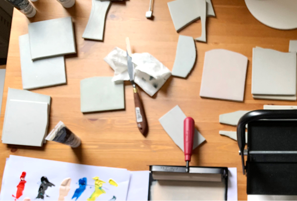
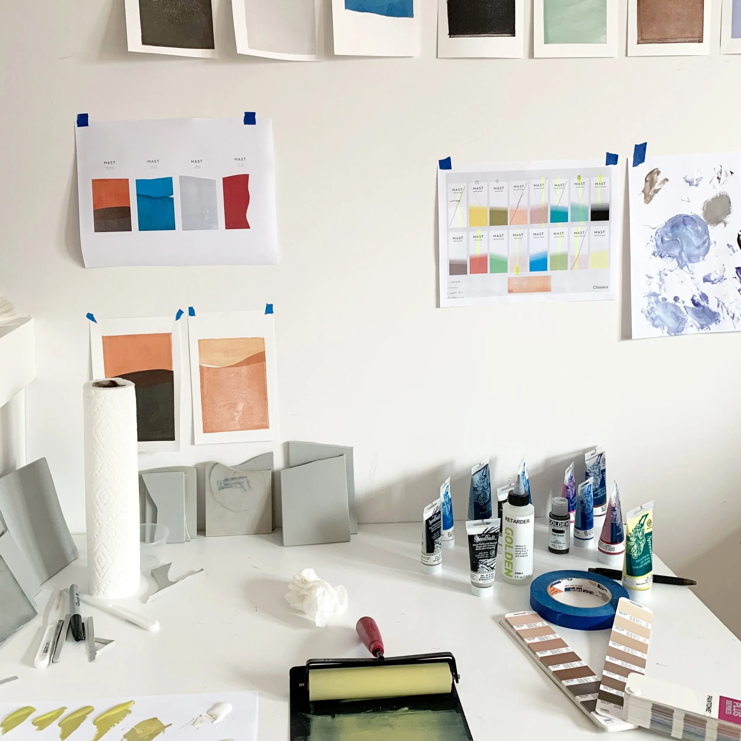
I selected specific Pantone colors for each chocolate flavor in the Mast Collection. With the color palette defined, I began to produce numerous prints, experimenting extensively with various shapes and colors.
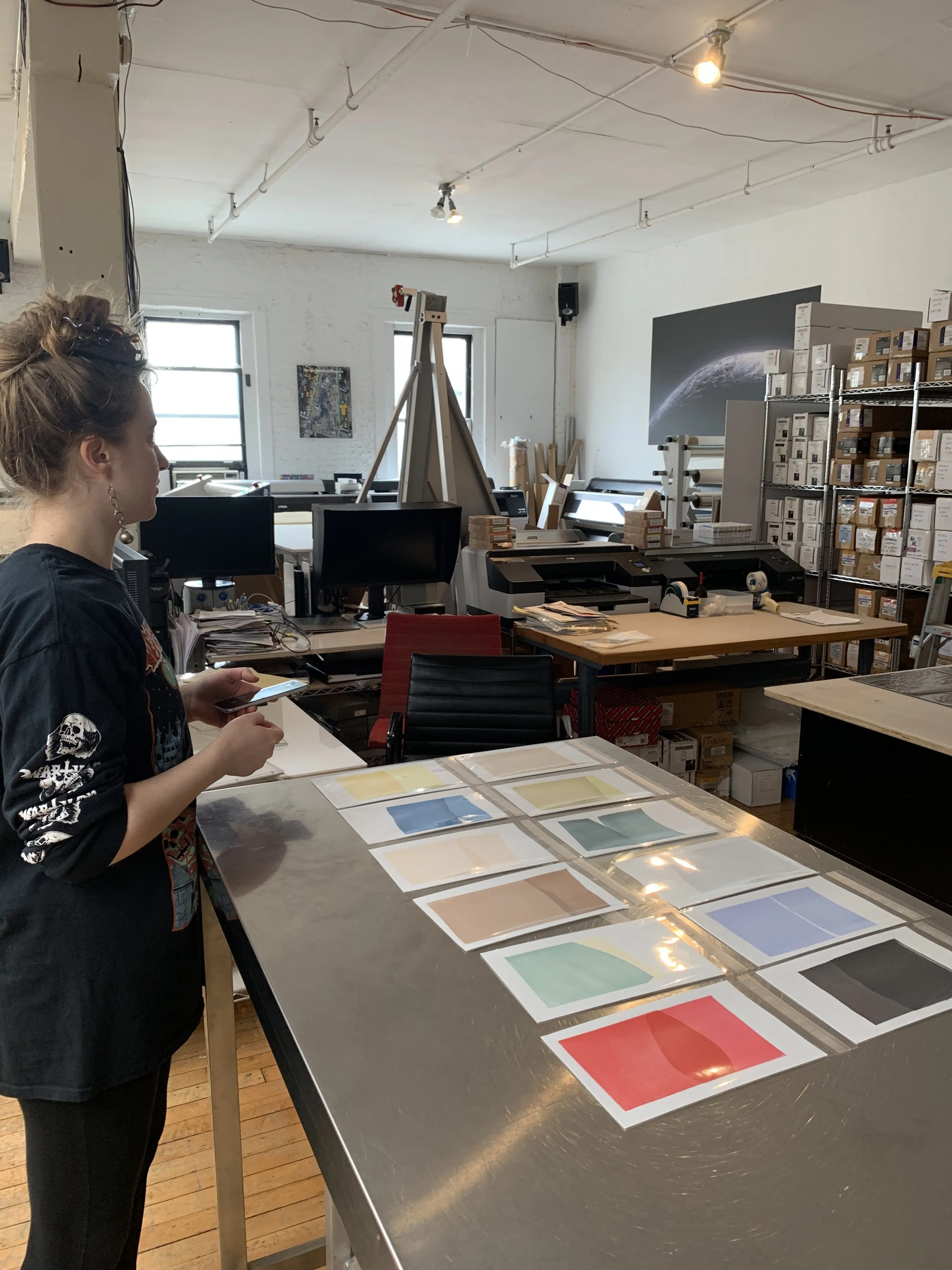
The Iterative Process
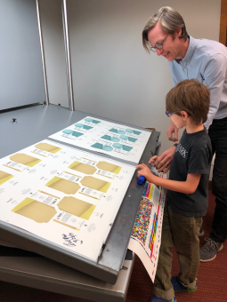
Scanning the Artwork
Once the final artwork was chosen, I had the artwork professionally scanned. Thanks Skink Ink!
(They were really great to work with and nailed the coloring 💪)
Graphic Design Process
Time to design the packaging in Adobe Creative Suite.
Testing Packaging and Printing
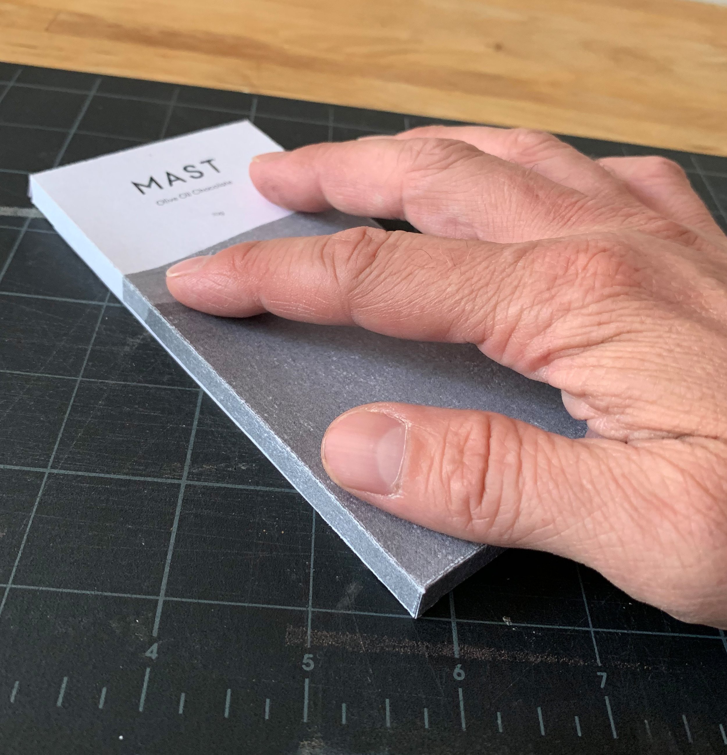
I printed out the files on different weighted paper and tested the design, layout, look and feel.
Client Review and Production Printing
The client reviewed and approved the designs (they were thrilled with the designs!)
Off to production printers!